I have gotten many questions about futures data recently and decided to take some time and explain some of the most important issues to consider when thinking about what data to plot. If you never imagined that there are choices to consider then look at this quick example using 10 year treasury futures, one of the most actively traded contracts in the world.
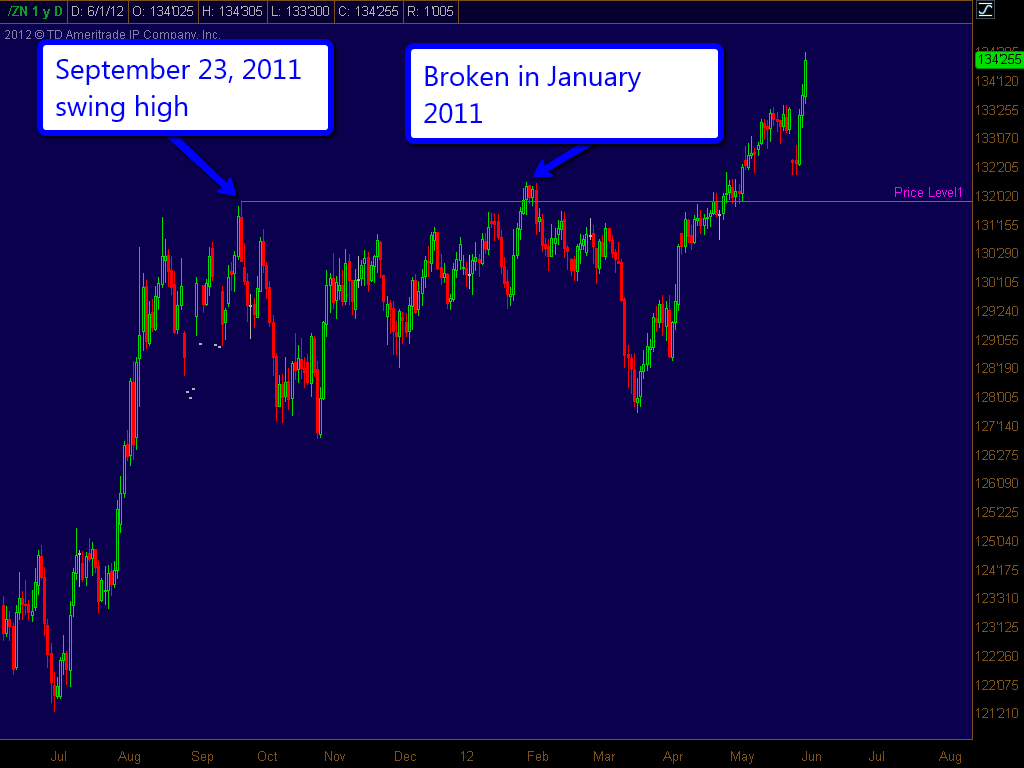
Let’s start by looking at a chart of symbol “/ZN” from ThinkOrSwim:
[click image for larger view]
Pay attention to the swing high from September 23, 2011 and notice how it holds as a high until it is bested on January 30, 2012. Now let’s compare it to the chart of symbol “@TY” from TradeStation:
[click image for larger view]
Here, too, we have a swing high on September 23, 2011 and a break above that level but there were also two previous breaks above that level which are not observed on the ThinkOrSwim chart.
If you trade any futures contract, not just treasuries, then you really should understand the difference between these two charts. Let’s get a few things out of the way, it’s not the difference between the symbols. Both symbols, “/ZN” on ThinkOrSwim and “@TY” on TradeStation, are the correct symbol for the 10 Year U. S. Treasury futures contract traded at the CBOT.
So if these are both charts of the same contract, which one is right? In reality, nobody can say. Just as if there are two versions of a fable such as the goose that laid the golden egg nobody could say which was right. In a fictional story, everyone can make up their own version and with no reality to compare it to nobody can assert which is correct. In the case of the two charts we looked at, both are fiction. Really!
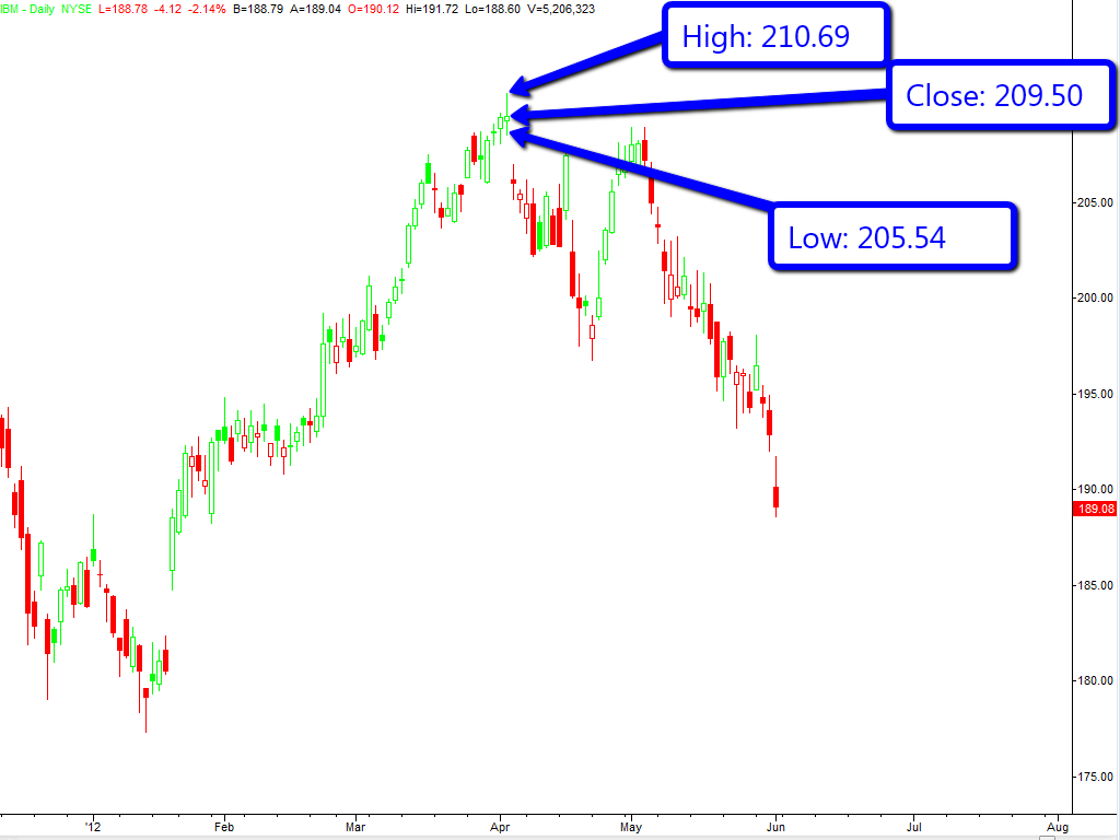
To think about the idea of truth versus fiction, let’s think about the chart of a stock like IBM. When we look at a daily chart of IBM:
[click image for larger view]
On April 3, 2012 IBM traded as high as 210.69 (its all-time high), as low as 205.54, and it closed at 209.50. At each of these prices someone bought IBM shares and someone else sold IBM shares. So we can say that the IBM chart reports what happened on the stock exchange and so long as it is faithful in that report we can say that it represents truth.
Futures markets, however, have important differences from stock markets that we need to consider. The most obvious difference is that futures contracts expire which means that new contracts come into existence at regular intervals and stop trading after they expire. For example the June 2008 10 Year U. S. Treasury contract first traded on March 22, 2007 and had its last trade on June 19, 2008. For an individual contract we can actually plot the “truth” of how it traded while it was in existence as in the chart below.
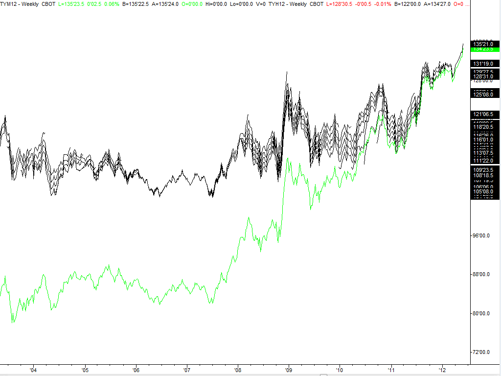
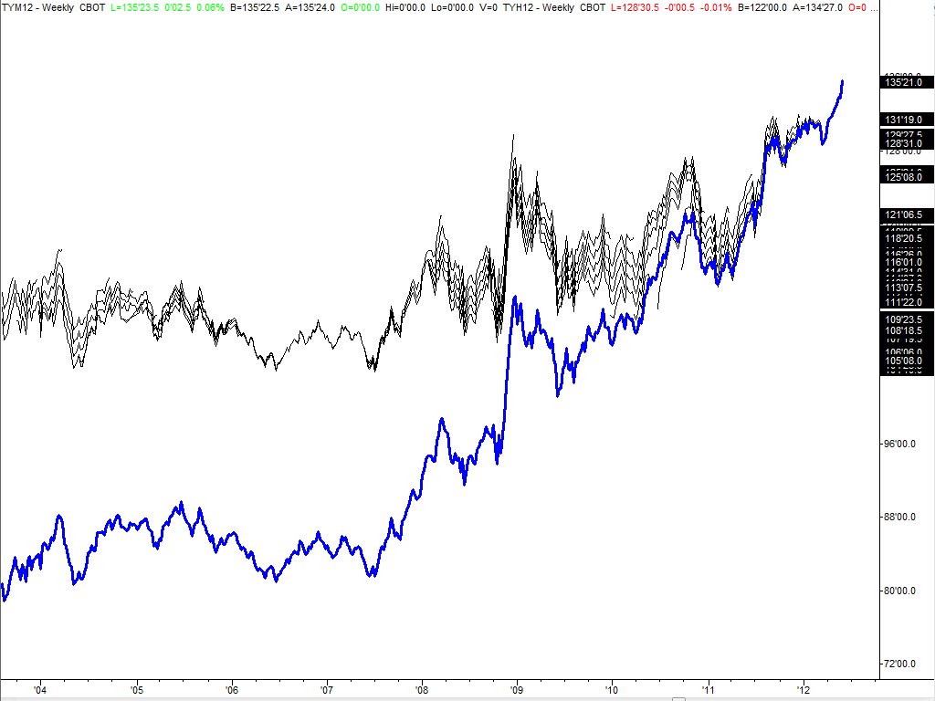
And even though we can get a “truth” chart, there are several reasons why it might not meet our needs but we need to see more to understand why. Let’s dig further by looking at the chart below which shows the weekly closing values of all traded 10 Year Treasury futures contracts from 2003 through 2012 in black as well as the @TY continuous contract in blue.
[click image for larger view]
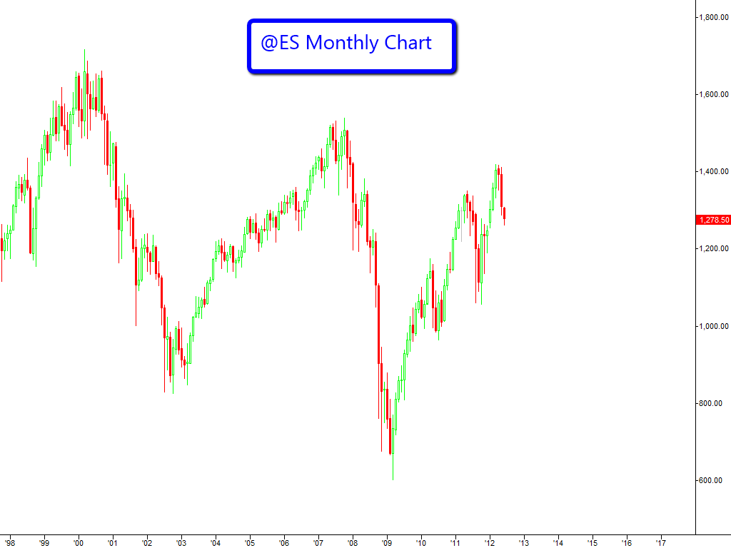
So let’s say we want to look at the swing high in late 2008 and compare that to the peak in 2010. We can see a range of different prices at each peak depending on the contract. What contracts should we compare? None of the contracts which traded in late 2010 even traded in late 2008 so we can’t do it directly. Some of the 2008 values are higher than some of the 2010 values and vice versa. The blue line is the @TY symbol, a form of continuous contract designed to give a single data series that we can plot. Notice, however, that there are regions of the chart where the blue line is nowhere near any of the black lines. That means that the blue line isn’t telling us anything about where futures actually traded on certain days. That is why we say that the blue line is a fiction. Still don’t believe it? Check out the chart of the monthly E-Mini S&P 500 Futures below. It shows a peak in 2000 and then a lower high in 2007. This did not happen, no contract traded anywhere near 1700 in 2000 as shown by the chart. Nevertheless, if we simply call up the @ES chart as many are told to do, this fiction is what is returned to us.
[click image for larger view]
Since the continuous contract is useful for some things we won’t get rid of it entirely, but we need to understand how it is constructed so we know what we are looking at on our charts and we use it for appropriate purposes. As we already saw earlier, the different methods used by @TY on TradeStation and /ZB on ThinkOrSwim give materially different results. So while the details might be complicated, we can’t actually understand what our charts are telling us unless we know how the long-term charts are constructed.
Remember we observed that different contracts trade at different prices at the same time. This is because futures always trade at a discount to the spot market except in particularly rare and unusual circumstances. A full discussion of the difference in prices is beyond the scope of this discussion, but a simple example will help to explain it. Let’s say that corn for delivery six months from now is trading at $5.00 a bushel. Today’s spot market might be $5.25 a bushel. The difference is the cost to store the corn for six months and the interest on the value of the corn for that same time period.
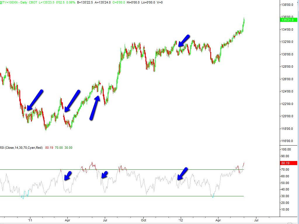
That explains the difference in price of the various contracts since those further away from expiration will trade at a lower price. This is true of stock index futures and bond futures as much as it is of commodity futures like corn or copper. It also tells us that the contract that has a price closest to the spot market will be the one which is nearest to its expiration. So if we wanted to chart a long term chart, one way to do it could be to always plot the nearest to expire. Once it stops trading, switch the plot to show the prices of the next nearest expiration. Let’s look at a chart of the daily nearest to expire contract for TY:
[click image for larger view]
Notice that there are gaps in the chart when the contract changes. That’s because when one expires it should trade at almost the same price as the spot market and the following day the new nearest to expire is three months away from expiration. The gaps can cause real problems with indicators. In three of the four gaps on the chart, the move dropped RSI from above 50 to below 50. Since some view this as a change from a bull trend to a bear trend, this is a significant difference. If one is charting intraday timeframes the impact on indicators is even more pronounced.
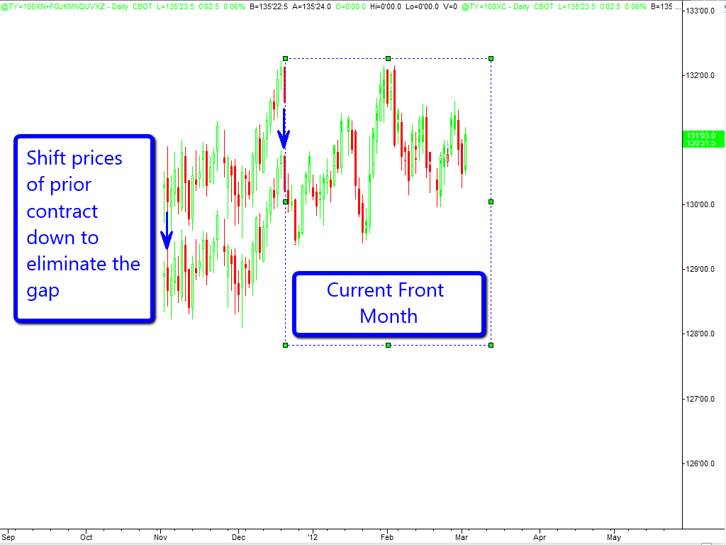
These gaps notwithstanding, the nearest to expire has the advantage that it is closest to spot. So if we want to compare support and resistance levels, look for breakouts, or otherwise compare price levels across long periods of time then this may be the preferred way to view charts. If we want to use indicators then we may want a smoother data stream. This is where we come back to the @TY and /ZB symbols which are both forms of continuous contracts. As we saw, both of these are smoothed out, but they look different because there’s more than one way to construct them. The most basic method is shown below:
[click image for larger view]
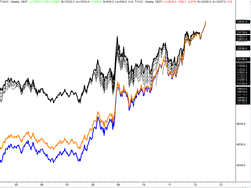
The basic idea is that at each contract roll-over prices are shifted until they align. Some refer to this as the “panama canal” method since it resembles the way the locks raise and lower ships to compensate for the difference in the water level of the Atlantic and Pacific oceans. The ships is simply shifted in its entirety until the level matches the level of the ocean on the other side. One advantage of this approach is that the price change on any given day should be roughly the price change of the nearest to expire contract on that day. The downside of this approach is that it accelerates the development of the difference between the continuation contract and the active contract. You can see how quickly they diverge in the chart below:
[click image for larger view]
The Panama canal method is also known as the absolute difference method and it is the easiest to understand, but it isn’t the most common. That distinction goes to the ratio back adjustment method. In order to understand this method let’s think about the IBM chart again because it isn’t quite as truthful as we might want to think. That’s because it has been adjusted for splits so if we go back to before the most recent split IBM didn’t trade at the prices shown on the chart. Instead all the prices on the chart prior to the most recent two-for-one split have been divided by 2 in order to represent a smooth data stream. The ratio back adjustment method of creating a continuous contract is based on the same idea: instead of shifting prices down they all the prices prior to roll-over are divided by whatever amount will cause the gap to be removed.
[click image for larger view]
Notice on the chart above that the ratio back adjusted continuous contract in orange doesn’t diverge quite as rapidly as blue line which is adjusted by absolute difference. However, the black nearest to expire series stays right with the current active contract. We’ve already established that none of these is “right” so which one makes sense to use? There is no hard and fast right answer for every purpose. But now that you know what is actually happening in the construction of your charts you can at least consider and compare the alternatives and think about what is best for your use. I will share my approach, but they are merely my opinions.
I will do my long-term charting work on spot market charts whenever possible. That is, I simply don’t pay much attention to an ES monthly chart when I have a S&P 500 cash index chart available. I trade the Euro futures but I do all my charting of the EURUSD spot market and take a trade in the futures when I have a setup. Some may say that this puts me at a disadvantage because I may not have a specific price to compare swing points with when setting stops or for overnight trading. This is true. I prefer to estimate based on my knowledge of the spot market chart than to rely on a level I know to be fiction.
One could argue that the levels on the futures charts are meaningful so long as others are trading based on them. I can’t argue against this viewpoint — it is valid. It’s just not how I choose to trade.
I don’t have spot market data available for every market I trade. There are firms which collect and distribute spot market prices for cocoa, lean hogs, and other commodity markets I participate in but I don’t have that data. In those markets, I prefer to do my long-term charting using the nearest to expire contract because it should be closest to spot.
For short-term charts I don’t use any form of continuous series at all. I prefer to do the chart work on the individual contract instead. So if I am trading June E-Mini S&P then that’s the contract I use for short-term charts.
When back-testing trading strategies I will use a continuous contract. Most good books on trading system development have a thorough discussion of the implication of the choice of futures data on back testing.

2 Responses to “What You Don’t Know About Your Futures Data Can Hurt You” Leave a reply ›
Interesting that your bias is towards the non-continous contracts (/esm3), but how does that jive with the new Voodoo FibGrid working on the continuous prices like /ES?
The behavior of Voodoo Lines with respect to specific contracts that you mention is for the TOS platform only is because of limitations of that platform as I try to make the product easier to use with automatic symbol detection.
This article is not meant to suggest that continuous contracts are universally bad but that one needs to see if they make sense with the way one is interpreting the information given by the chart. Some indicators will give better results if they don’t have sudden breaks and might perform better with a continuous contract. However, comparing highs and lows becomes worthless.
Specific issues related to choice of contract are discussed in the PDF usage guide for Voodoo Lines.
This article points out that on many platforms there is an option to display a front month continuation series which might be more appropriate in some circumstances. This is generally the best choice for use with Voodoo Lines. Unfortunately it’s not available on TOS.
Note that if one limits themselves to only looking at current prices since the last roll over then the choice of symbol doesn’t matter because the continuous contract, front month continuation, and specific contract will all show the same price.