We receive more questions about how to interpret DynaRange than any other indicator. Perhaps that’s because it doesn’t really work like any other indicator that traders have experienced before. So if you’ve had questions about DynaRange, read on. By the end you will know the answer to these frequent questions:
- What is the best timeframe to use for DynaRange?
- Why doesn’t DynaRange show me any targets?
- Why did price go through all the DynaRange targets?
Let’s look at some examples.
[click image to enlarge]
First is a daily chart of GOOG. Notice how many of the swing points are near DynaRange support and resistance areas. Certainly not all, but many. And not all are exact hits, but the support and resistance levels are obvious. There are other stock charts out there where DynaRange looks perfect, but we want to be as realistic as possible in this discussion.
On the chart we have highlights two moves, a bullish move up from a swing low and a bearish move down from a swing high. While the moves are in different directions, they both highlight what DynaRange does:
- Identifies a swing high or low;
- Identifies a trending move away from that swing point; and then
- projects where that trend move might end.
Some important things to remember:
- DynaRange levels are specific to the timeframe used.
- DynaRange levels are not hard and fast long-term support or resistance. Rather they are places where a specific trending move might end.
- When look to see preceding swing point to be aware which move might be ending.
[click image to enlarge]
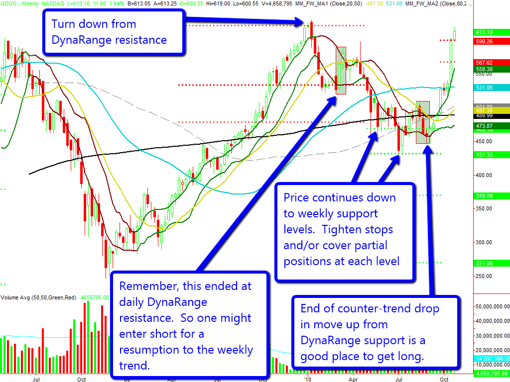
The two moves highlighted on the GOOG daily chart are also highlighted on the weekly chart. Notice that each was a counter-trend move in a larger trend. We highlight how one might use the combination of Weekly and daily DynaRange levels to trade GOOG. In practice, you might want to look for confirmation from other indicators.
[click image to enlarge]
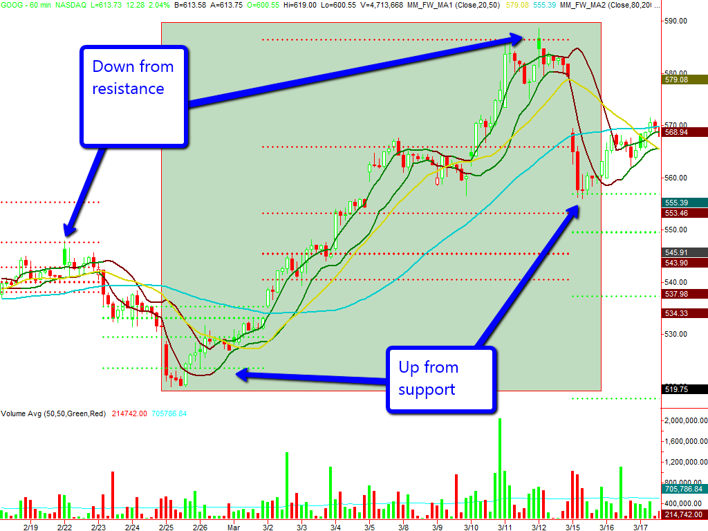
Next we’ll zoom into the first highlighted area on an hourly chart. Notice how the turn down from a daily DynaRange resistance level was also a turn down from resistance on the hourly chart. That would increase our confidence that both the hourly and daily were returning to the downward trend established on the weekly chart.
[click image to enlarge]
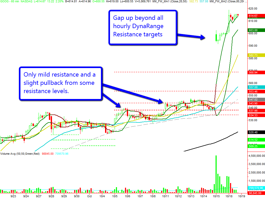
On a more recent hourly chart of GOOG we notice that price has gapped up beyond all DynaRange levels. Recall that at the right edge of both our Weekly and Daily charts, GOOG is in an uptrend. One way to interpret this is that we did have an end to hourly moves at the resistance levels, but the mild pullbacks were not sufficient to establish downside DynaRange targets. However you interpret it, it is a reminder that one always needs to be aware of the larger picture and only enter counter-trend trades carefully, especially around earnings and news.
[click image to enlarge]
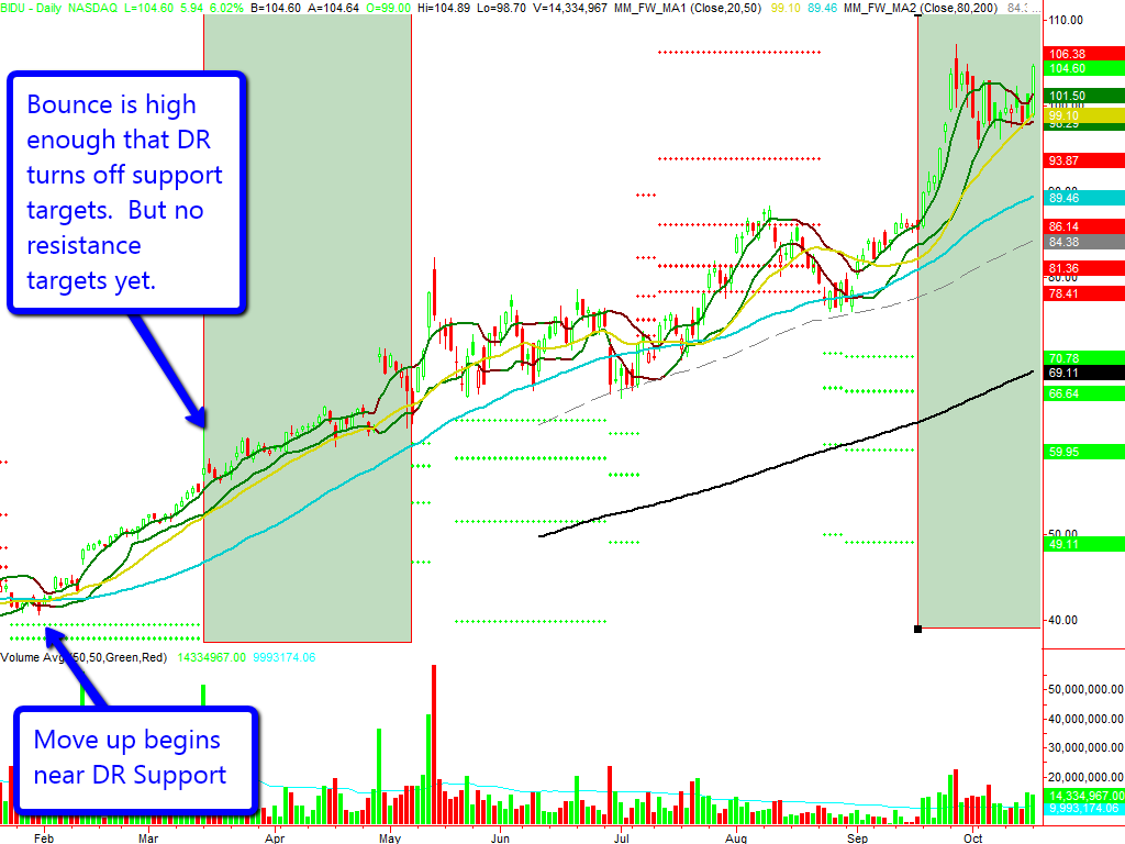
Next we’ll look at GOOG’s Chinese competitor, BIDU, again on a daily chart. Again we see some reversals at DynaRange support and resistance levels. However, notice the highlighted vertical bands where we have no levels showing. The first band starts at the place where a move up is strong enough that DynaRange can tell it needs to look for targets above instead of below. However, the move either:
- hasn’t yet gotten near enough to completion to generate a target; or
- hasn’t yet shown the characteristics that DynaRange needs to identify how far the move might travel.
Only future price action will allow us to tell the difference. In this case we can see that BIDU had much farther to travel. The point to remember: when no DynaRange levels are showing, DynaRange cannot predict the length of the current move hasn’t found a trend.
[click image to enlarge]
The absence of targets on the daily, doesn’t mean that there aren’t trends in other timeframes that are obvious to DynaRange as can be seen on an hourly chart that drills into the first highlighted range on from the BIDU daily chart.
Because the BIDU daily chart was moving up from a DynaRange support level, the preferred approach on the hourly would be to buy support and sell to cover at resistance, rather than selling short at resistance.
By now, hopefully it is clear that:
- DynaRange DOES measure the possible length of a trending move in a particular timeframe.
- DynaRange DOES NOT measure daily, weekly, monthly, hourly support or resistance, or support or resistance for any timeframe. It only measures for specific moves.
- DynaRange DOES NOT always print targets. When it doesn’t, price may not be trending or the end of the trend may not be predictable by DynaRange.
- Prices do not need to stop at DynaRange targets. This is always true, but especially so when the prevailing trend in other timeframes suggests a move in the opposite direction.
- The right timeframe to use for DynaRange is the one where the move you’re measuring shows clear trend. Always look at multiple timeframes.
As always, we strongly suggest that you fully test trading strategies using DynaRange and all other indicators fully before trading with real money. The trading ideas presented here are just that and intended to describe some ways in which DynaRange may be used. They are not full trading strategies.


No Responses to “Understanding DynaRange” Leave a reply ›