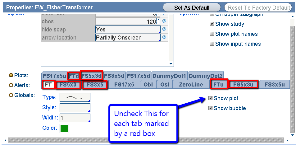
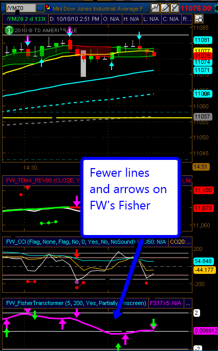
FW has changed his fisher chart to remove lines and signals he finds distracting. If you want to make you study look like the ones that FW shows in shared chat and in the E-Mini Room, go into Edit Studies and go to each of the plot tabs highlighted by a red box and then click the check box shown by the arrow to UNCHECK “Show Plot” This will remove the plots that FW no longer uses.
FW also sets the obos to 200.
This will work with the FW_Fisher_Transformer study built-in to TOS or with the versions available in the Community Studies section of FWTrader.
[click image to enlarge]
When done, your chart should look like FW’s:


5 Responses to “Make Your Fisher Chart Look Like FW’s” Leave a reply ›
On TOS build 1759, I unchecked the plot for the 7 tabs shown above. However, I see only pink and blue arrows, there are no green ones. Just wondering whether it is correct?
He does change his setup from time-to-time. At the time I wrote that he had most of his charts setup with only the purple line and the purple and green arrows. As I type it seems he has a mix of that setup and one with all lines and arrows showing. Certainly choose what works best for you.
Thank you Managematics for your response! It works great! signal on a 15 min intraday chart works well for day trading.
When I set up the way you say to set up I am NOT getting plots that you show. In fact what I am getting ae just straight lines with different colors. I am getting arrows point up an down, but no definition of the plots
The settings seem to work for most people. The forums here on FWTrader or the David Elliott chat on TOS are good places to ask questions about the community indicators. Diagnosing individual issues may depend on the symbol, timeframe, settings, etc…